Data visualizations are reaching global audiences. As people who use Right-to-left (RTL) scripts constitute over a billion potential data visualization users, a need emerges to investigate how visualizations are communicated to them. Web design guidelines exist to assist designers in adapting different reading directions, yet we lack a similar standard for visualization design. This paper investigates the design patterns of visualizations with RTL scripts. We collected 128 visualizations from data-driven articles published in Arabic news outlets and analyzed their chart composition, textual elements, and sources. Our analysis suggests that designers tend to apply RTL approaches more frequently for categorical data. In other situations, we observed a mix of Left-to-right (LTR) and RTL approaches for chart directions and structures, sometimes inconsistently utilized within the same article. We reflect on this lack of clear guidelines for RTL data visualizations and derive implications for visualization authoring tools and future research directions.
@inproceedings{alebri2024design,title={Design patterns in rightto-left visualizations: the case of arabic content},author={Alebri, Muna and Rakotondravony, No{\"e}lle and Harrison, Lane},booktitle={2024 IEEE Visualization and Visual Analytics (VIS)},pages={251--255},year={2024},organization={IEEE},label={short}}
Viz4NetSec: Visualizing Dynamic Network Security Configurations of Everyday Interconnected Objects in Home Networks
Noëlle Rakotondravony, Henrich C Pöhls, Jan Pfeifer, and 1 more author
In International Conference on Human-Computer Interaction, 2024
Controlling the communication of devices within a network by com- partmentalization or segmentation is one of many techniques to protect and improve the overall security of networked systems. Meaningful in- strumentation of network segmentation requires having an overview of the devices that participate in the network; only then users can seize con- trol of what devices are allowed to do in terms of communication. In this work, we consider a minimized set of network security controls (i.e. allow connections, allow in-bound-only, allow out-bound-only) that can be implemented using modern routers with built-in firewall or even Soft- ware Defined Networking (SDN) capabilities. We present Viz4NetSec, a node-link diagram for visualizing typical home user network scenarios. The visualization is integrated in an existing smart home control software and provides an interactive interface through which a smart home user can find, dynamically interact with, and isolate devices by setting SDN flow rules. The aspect of dynamicity in this paper is important as we en- vision that everyday users would reasonably need interactions to trigger configuration changes that directly change the network’s or the device’s behavior because this enabled users to configure network rules in a trial and error or ‘gamified’ fashion. Thus, dynamicity empowers adapting se- curity decisions (mostly in the sense of privacy) to their ever-changing everyday digital lives. We conclude this work with an evaluation of the proposed network visualization, discussing how home network users can use the available functionalities in Viz4NetSec to perform the isolation of devices within the network as the most simple security related task.
@inproceedings{rakotondravony2024viz,title={Viz4NetSec: Visualizing Dynamic Network Security Configurations of Everyday Interconnected Objects in Home Networks},author={Rakotondravony, No{\"e}lle and P{\"o}hls, Henrich C and Pfeifer, Jan and Harrison, Lane},booktitle={International Conference on Human-Computer Interaction},pages={164--185},year={2024},organization={Springer Nature Switzerland Cham},label={paper}}
2023
Beyond English: Centering Multilingualism in Data Visualization
Noëlle Rakotondravony, Priya Dhawka, and Melanie Bancilhon
Information visualization and natural language are intricately linked. However, the majority of research and relevant work in information and data visualization (and human-computer interaction) involve English-speaking populations as both researchers and participants, are published in English, and are presented predominantly at English-speaking venues. Although several solutions can be proposed such as translating English texts in visualization to other languages, there is little research that looks at the intersection of data visualization and different languages, and the implications that current visualization practices have on non-English speaking communities. In this position paper, we argue that linguistically diverse communities abound beyond the English-speaking world and offer a richness of experiences for the visualization research community to engage with. Through a case study of how two non-English languages interplay with data visualization reasoning in Madagascar, we describe how monolingualism in data visualization impacts the experiences of underrepresented populations and emphasize potential harm to these communities. Lastly, we raise several questions towards advocating for more inclusive visualization practices that center the diverse experiences of linguistically underrepresented populations.
@article{rakotondravony2023beyond,title={Beyond English: Centering Multilingualism in Data Visualization},author={Rakotondravony, No{\"e}lle and Dhawka, Priya and Bancilhon, Melanie},journal={Workshop on Visualization for Social Good},year={2023},label={workshop}}
2022
Probablement, Wahrscheinlich, Likely ? A Cross-Language Study of How People Verbalize Probabilities in Icon Array Visualizations
Noëlle Rakotondravony, Yiren Ding, and Lane Harrison
IEEE Transactions on Visualization and Computer Graphics, 2022
Visualizations today are used across a wide range of languages and cultures. Yet the extent to which language impacts how we reason about data and visualizations remains unclear. In this paper, we explore the intersection of visualization and language through a cross-language study on estimative probability tasks with icon-array visualizations. Across Arabic, English, French, German, and Mandarin, n = 50 participants per language both chose probability expressions — e.g. likely, probable — to describe icon-array visualizations (Vis-to-Expression), and drew icon-array visualizations to match a given expression (Expression-to-Vis). Results suggest that there is no clear one-to-one mapping of probability expressions and associated visual ranges between languages. Several translated expressions fell significantly above or below the range of the corresponding English expressions. Compared to other languages, French and German respondents appear to exhibit high levels of consistency between the visualizations they drew and the words they chose. Participants across languages used similar words when describing scenarios above 80% chance, with more variance in expressions targeting mid-range and lower values. We discuss how these results suggest potential differences in the expressiveness of language as it relates to visualization interpretation and design goals, as well as practical implications for translation efforts and future studies at the intersection of languages, culture, and visualization. Experiment data, source code, and analysis scripts are available at the following repository: https://osf.io/g5d4r/.
@article{rakotondravony2022probablement,author={Rakotondravony, No\"{e}lle and Ding, Yiren and Harrison, Lane},title={{Probablement, Wahrscheinlich, Likely ? A Cross-Language Study of How People Verbalize Probabilities in Icon Array Visualizations}},journal={IEEE Transactions on Visualization and Computer Graphics},year={2022},volume={29},number={1},pages={1189-1199},doi={10.1109/TVCG.2022.3209367},label={full}}
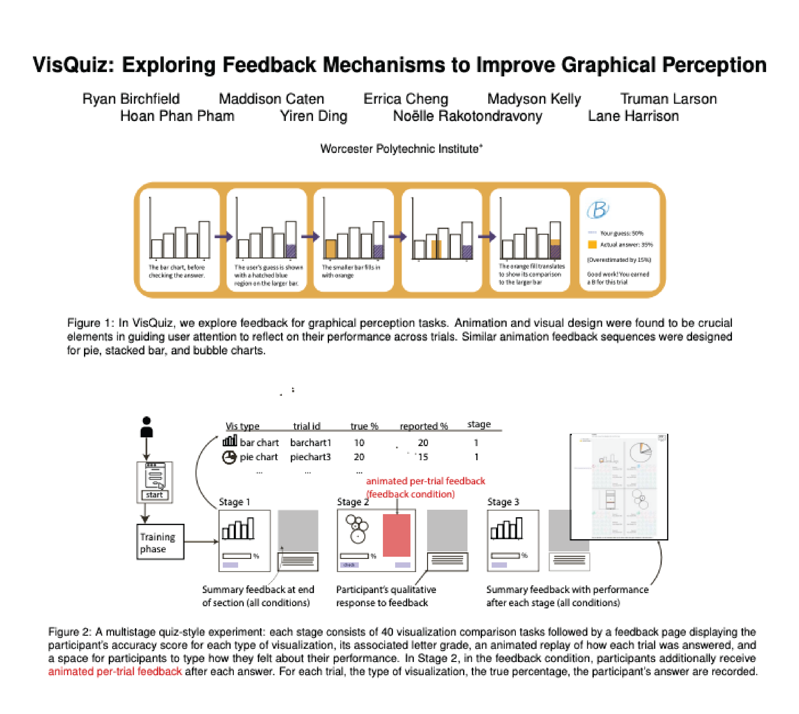
VisQuiz: Exploring Feedback Mechanisms to Improve Graphical Perception
Ryan Birchfield, Maddison Caten, Errica Cheng, and 6 more authors
IEEE Visualization and Visual Analytics (VIS), 2022
In this paper, we explore the design and evaluation of feedback for graphical perception tasks, called VisQuiz. Using a quiz-like metaphor, we design feedback for a typical visualization comparison experiment, showing participants their answer alongside the correct answer in an animated sequence in each trial, as well as summary feedback at the end of trial sections. To evaluate VisQuiz, we conduct a between-subjects experiment, including three stages of 40 trials each with a control condition that included only summary feedback. Results from n = 80 participants show that once participants started receiving trial feedback (Stage 2) they performed significantly better with bubble charts than those in the control condition. This effect carried over when feedback was removed (Stage 3). Results also suggest an overall trend of improved performance due to feedback. We discuss these findings in the context of other visualization literacy efforts, and possible future work at the intersection of visualization, feedback, and learning. Experiment data and analysis scripts are available at the following repository https://osf.io/jys5d/
@article{birchfield2022visquiz,author={Birchfield, Ryan and Caten, Maddison and Cheng, Errica and Kelly, Madyson and Larson, Truman and Pham, Hoan Phan and Ding, Yiren and Rakotondravony, No{\"{e}}lle and Harrison, Lane},title={VisQuiz: Exploring Feedback Mechanisms to Improve Graphical Perception},booktitle={2022 IEEE Visualization and Visual Analytics (VIS)},journal={IEEE Visualization and Visual Analytics (VIS)},volume={abs/2207.09534},year={2022},pages={95--99},doi={10.1109/VIS54862.2022.00028},label={short},}
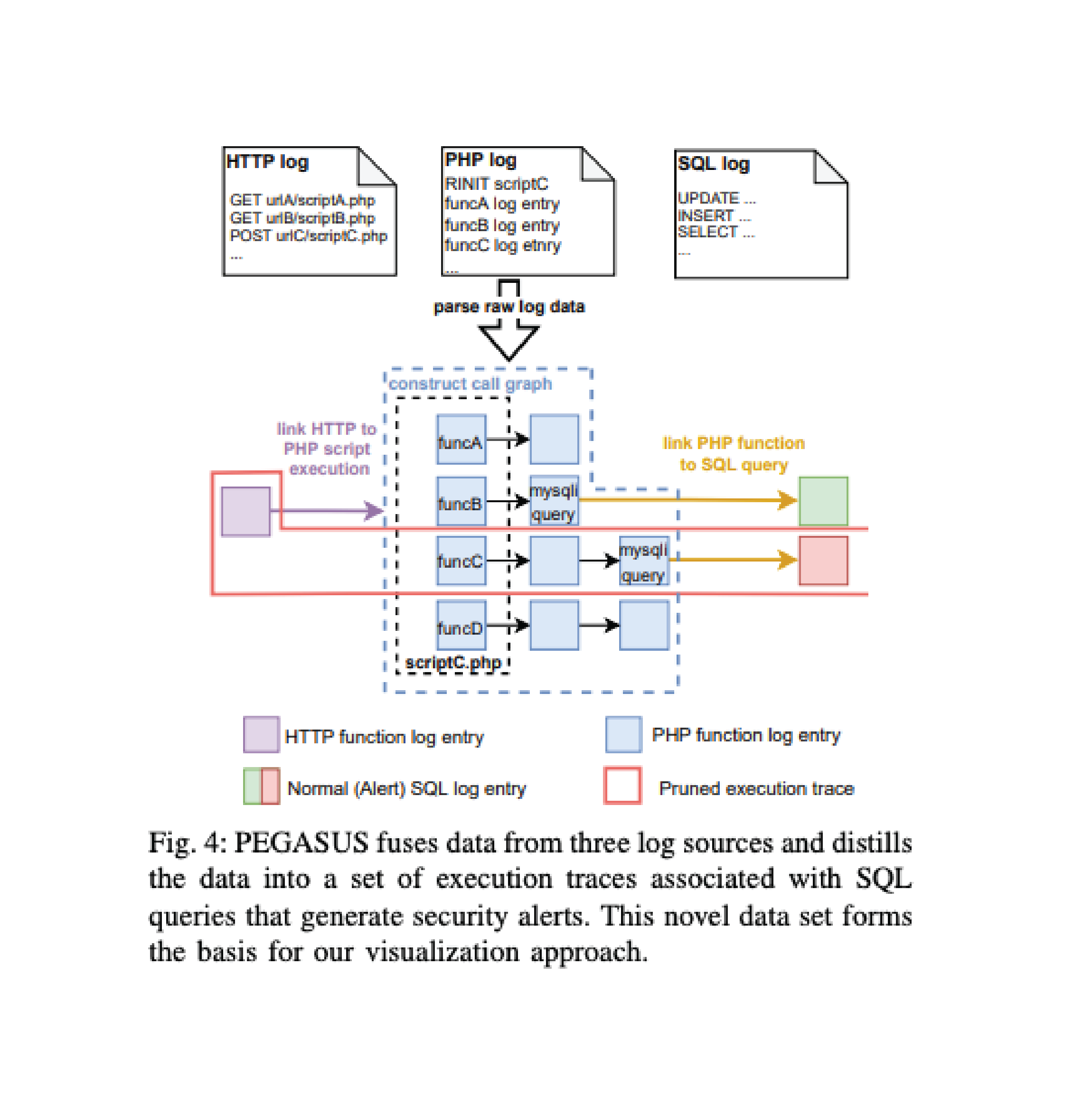
Visualizing Web Application Execution Logs to Improve Software Security Defect Localization
Matthew A. Puentes, Yunsen Lei, Noëlle Rakotondravony, and 2 more authors
In IEEE International Conference on Software Analysis, Evolution and Reengineering, SANER 2022, 2022
Interactive web-based applications play an important role for both service providers and consumers. However, web applications tend to be complex, produce high-volume data, and are often ripe for attack. Attack analysis and remediation are complicated by adversary obfuscation and the difficulty in assembling and analyzing logs. In this work, we explore the web application analysis task through log file fusion, distillation, and visualization. Our approach consists of visualizing the logs of web and database traffic with detailed function execution traces. We establish causal links between events and their associated behaviors. We evaluate the effectiveness of this process using data volume reduction statistics, user interaction models, and usage scenarios. Across a set of scenarios, we find that our techniques can filter at least 97.5% of log data and reduce analysis time by 93–96%.
@inproceedings{puentes2022visualizing,author={Puentes, Matthew A. and Lei, Yunsen and Rakotondravony, No{\"{e}}lle and Harrison, Lane T. and Shue, Craig A.},title={Visualizing Web Application Execution Logs to Improve Software Security Defect Localization},booktitle={{IEEE} International Conference on Software Analysis, Evolution and
Reengineering, {SANER} 2022},pages={1183--1190},publisher={{IEEE}},year={2022},url={https://doi.org/10.1109/SANER53432.2022.00138},doi={10.1109/SANER53432.2022.00138},timestamp={Tue, 26 Jul 2022 14:23:18 +0200},biburl={https://dblp.org/rec/conf/wcre/PuentesLRHS22.bib},bibsource={dblp computer science bibliography, https://dblp.org},}
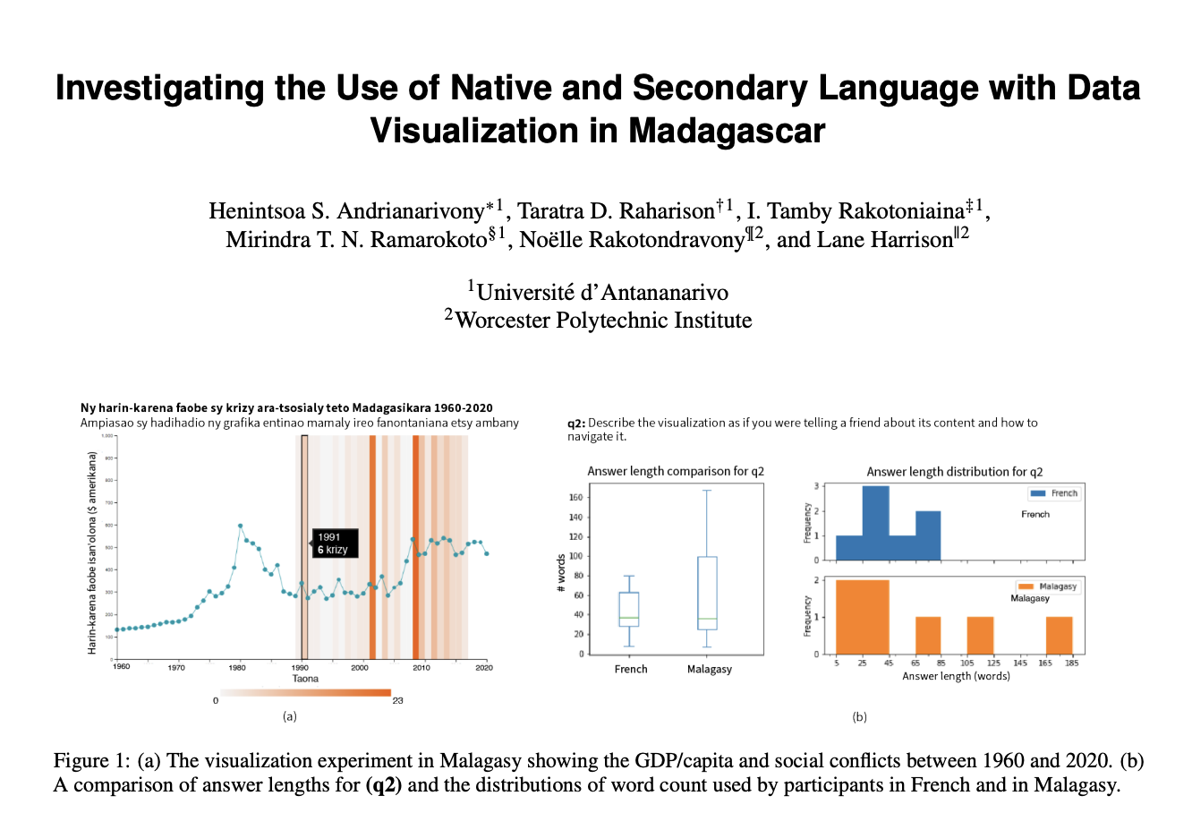
Investigating the Use of Native and Secondary Language with Data Visualization in Madagascar
Henintsoa S Andrianarivony, Taratra D Raharison, I Tamby Rakotoniaina, and 3 more authors
In this preliminary work, we investigate the impact of native versus secondary language in the design, exploration, and interpretation of data visualization. We focus on bilingual speakers in Madagascar, a predominantly Malagasy-speaking country with French as a common secondary language. In a between-subjects online study, n = 14 participants answered open-ended questions on how they interact with and communicate about a data visualization delivered in either their native (Malagasy) or secondary (French) language. Results suggest that a lack of expressive terms for visualization, data, and technical terminology in Malagasy impacted participant responses, with several using French terms even when prompted to answer in Malagasy, along with differences in answer length, fluency, and conciseness.
@article{andrianarivony2022investigating,title={Investigating the Use of Native and Secondary Language with Data Visualization in Madagascar},author={Andrianarivony, Henintsoa S and Raharison, Taratra D and Rakotoniaina, I Tamby and Ramarokoto, Mirindra TN and Rakotondravony, No{\"e}lle and Harrison, Lane},year={2022},label={poster},}
2020
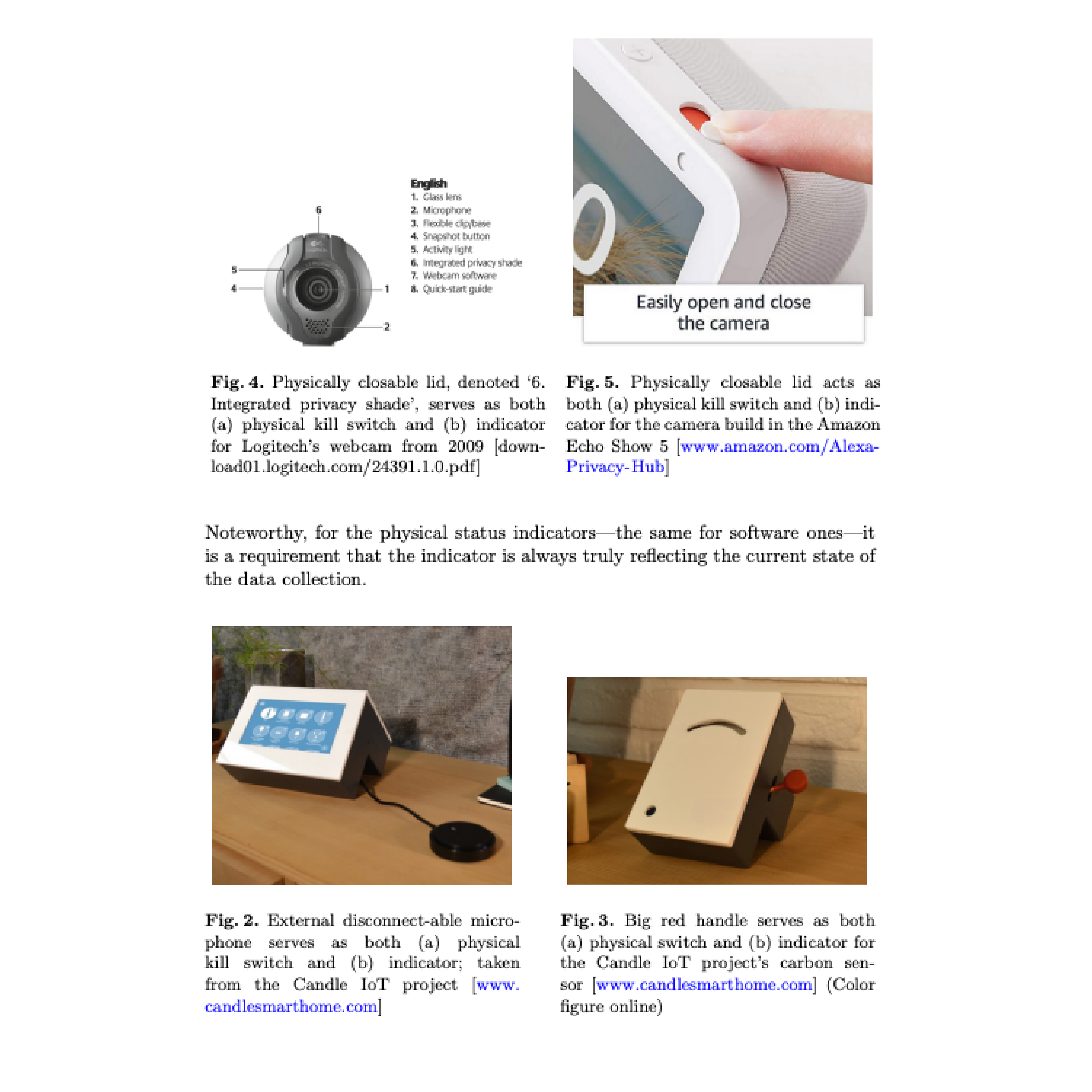
Dynamic Consent: Physical Switches and Feedback to Adjust Consent to IoT Data Collection
Henrich C. Pöhls, and Noëlle Rakotondravony
In 8th International Conf. on Distributed, Ambient and Pervasive Interactions, held as part of the 22nd HCI International Conference, 2020
@inproceedings{poehls2020dynamic,author={P{\"{o}}hls, Henrich C. and Rakotondravony, No{\"{e}}lle},editor={Streitz, Norbert A. and Konomi, Shin'ichi},title={Dynamic Consent: Physical Switches and Feedback to Adjust Consent to IoT Data Collection},booktitle={8th International Conf. on Distributed, Ambient and Pervasive Interactions, held as part of the 22nd {HCI} International Conference},series={Lecture Notes in Computer Science},volume={12203},pages={322--335},publisher={Springer},year={2020},url={https://doi.org/10.1007/978-3-030-50344-4\_23},doi={10.1007/978-3-030-50344-4\_23},biburl={https://dblp.org/rec/conf/hci/PolhsR20.bib},bibsource={dblp computer science bibliography, https://dblp.org},}
Visualization for Cyber Security and Security Analysts’ Use of Visualizations: Is There a Gap?
Noëlle Rakotondravony, and Lane Harrison
2020
poster
2018
Exploring the role of experts’ knowledge in visualizations for cyber security
Fabian Böhm, Noëlle Rakotondravony, Günther Pernul, and 1 more author
2018
Introducing DINGfest: An architecture for next generation SIEM systems
Florian Menges, Fabian Böhm, Manfred Vielberth, and 4 more authors
2018
Visualizing bft smr distributed systems-example of bft-smart
Noëlle Rakotondravony, and Hans P Reiser
In 48th Annual IEEE/IFIP International Conference on Dependable Systems and Networks Workshops (DSN-W), 2018
2017
Towards a Common Evaluation Framework for Cyber Security Visualizations
Noëlle Rakotondravony, and Hans P Reiser
2017
Classifying malware attacks in IaaS cloud environments
Noëlle Rakotondravony, Benjamin Taubmann, Waseem Mandarawi, and 6 more authors
Journal of Cloud Computing, 2017
Towards a Generic Architecture for Interactive Cost-Aware Visualization of Monitoring Data in Distributed Systems
Noëlle Rakotondravony, Johannes Köstler, and Hans P Reiser
In Proceedings of the 4th Workshop on Security in Highly Connected IT Systems, 2017
2016
Cloudphylactor: Harnessing mandatory access control for virtual machine introspection in cloud data centers
Benjamin Taubmann, Noëlle Rakotondravony, and Hans P Reiser
In 2016 IEEE Trustcom/BigDataSE/ISPA, 2016
Libvmtrace: Tracing virtual machines
Benjamin Taubmann, Noelle Rakotondravony, and Hans P Reiser
Winter School on Operating Systems (WSOS), 2016
Integrity and authenticity protection with selective disclosure control in the cloud & IoT
Christoph Frädrich, Henrich C Pöhls, Wolfgang Popp, and 2 more authors
In International Conference on Information and Communications Security, 2016
Visualizing and controlling vmi-based malware analysis in iaas cloud
Noëlle Rakotondravony, and Hans P Reiser
In 2016 IEEE 35th Symposium on Reliable Distributed Systems (SRDS), 2016